All Violence is an Illustration of a Pathetic Stereotype - 1991

Chessboard - 2006

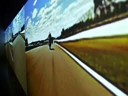
In Space no one can hear you scream - 1987
Research Kruger's work to find an example from the 1970s or 1980s to compare with a more recent work. How has Kruger's work changed with the developments in contemporary visual arts? Describe a recent work that moves away from the 'poster' type work of her early career.
Not alot of of things have changed from Kruger's famous 'Futura bold oblique' font boxed in red, black or white. But what is different is her more recent works in comparison to her works back 30 years is that she is more experimental with other things such as making her layout designs on a Chessboard (2006) and shes been doing things on a larger scale such as billboards and room installations. She also does these interesting four 'Face It (Cyan, Magenta, Green and Yellow)-2007'. These posters are relatively the same apart from colour, and what is written in the small box on the shirt.
How does the audience experience a more spatial, installation art work compared with a poster?
How does the audience experience a more spatial, installation art work compared with a poster is through the room itself, and it somewhat relates to the bubble we tend to keep ourselves in. How this appeals more than the poster itself is that it surrounds this 'bubble' that we secure ourselves with or with things in life a visual image of what it might look like if it were to be seen. It could also be seen, more of an invasion of the 'personal bubble' as well.
What elements does Kruger use in her work to create a strong impact?
Her ongoing political, social, feminist provocations and commentaries on religion, sex, racial and gender stereotypes, consumerism, corporate greed, and power are elements of what her work is based on. But the thing that creates a strong impact is the fact its simplified in image-wise but in return creates an extremely strong point that it's making through use of quotes with the 'in your face' futura bold oblique font.
Comment on the development of her work over the last 30 years.
Well by looking at the stuff she's made over the last 30 years, to be honest, the majority of them, scarily, look very similar, apart from a few such as 'Pray -2001' 'We wont play Nature to your culture - 1983' and 'In space no one can hear you scream - 1987'. By where I see her work, the development of her works is developed when the human race makes another wrong turn in history such as 'White, male, western = ideal person' which is stupid. Overall, I enjoy looking at her works because to me, its kinda like an artwork that you look at and it sucker punches you in the crumple zones, which all woman wish to do to a man who's ego goes against them.
reference:
http://www.arthistoryarchive.com/arthistory/feminist/Barbara-Kruger.html
http://en.wikipedia.org/wiki/Barbara_Kruger